The Importance of Wayfinding in Healthcare Design
By Genevieve Rogers
Healthcare Architect
By Julia Harmon
Interior Designer
You have been here before: You are in the corridor of a medical facility. You look one way—two white walls, a series of doors—then you look the other way and see the same sight. Where are you supposed to go? How are you supposed to know?
This experience of momentary disorientation in a building—especially in a medical facility, with its tangle of “racetrack” corridors and closed doors—is something that we have all experienced. As healthcare designers, when we are designing a new space, we use wayfinding to reduce or, hopefully, eliminate those feelings of confusion.
Wayfinding refers to a set of design strategies that designers use to orient people within an unfamiliar built environment and to help them navigate through it. The strategies we use include signage, color-coding, symbols, and other environmental cues. Wayfinding is how the built environment communicates with its users: offering simple, clear information on location and context, while reducing confusion and anxiety.
Wayfinding always emphasizes the experience of those who are either new to or unfamiliar with a space. In healthcare facilities, most patients and their families are not frequent visitors (and are often first-time visitors). Additionally, the process of receiving healthcare is often a stressful experience, so reducing those emotions through design is a way to improve overall patient experience and positively influence healthcare outcomes.
Giving patients a way to visually “read” the space
Signage—including words, symbols, and icons—is critical to orienting people in a space. However, anyone who has been lost in an international airport knows that signage is only so helpful. Even multilingual signage can be confusing, sometimes using less familiar language or icons that may not have universally shared meaning.
And while its utility is undeniable, there is something else working against signage: it requires some cognition on the part of the user in order to understand. Simply put, people must put active effort into reading signage in order to orient themselves.
Another way to orient users in a space is to bypass cognitive processes altogether. This strategy involves design elements that “speak” directly to users’ psychology, avoiding the extra effort of processing language or deciphering symbols. How can we do that? We go back to the basics! Most people have instinctive reactions to colors, shapes, lines, and patterns.
We can incorporate those elements into the built environment so that they orient people within the space, while making minimal cognitive demand.
For MOA’s Tepeyac Community Health Center project, we incorporated a dozen different colors to assist in orienting users. This served both to create vibrant and buoyant spaces, which elevate the moods of staff and visitors (more on that later), and create a visual “language” to help users navigate the facility.
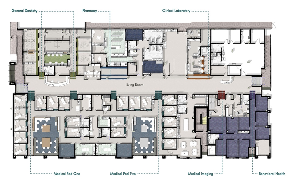
From the main lobby area where patients check in, they are confronted with six different provider spaces that they may need to access: medical, dental, pharmacy, imaging, behavioral health, and the laboratory. Our color scheme assigns two colors to each of these six departments. The main entry to each department features these two colors—one on the entire door wall and one on the floor. Upon entering the department space, these colors are incorporated into the floors and walls. This extensive use of color, in coordination with multilingual signage, provides visitors a way to quickly, and with minimal effort, familiarize themselves with the different provider spaces.
Colors, patterns, and geometric elements also help people build long-term associations with spaces. On future visits, the colors in the Tepeyac Center will “jump out” at users, helping them more readily recognize the provider spaces where they need to go. Likewise, these themed colors will assist users as they move between different provider spaces, e.g. from an exam room in the medical department to the pharmacy.
Keeping patients and staff separate
Given the sensitive nature of healthcare work, keeping staff separate from patients is key. Patients should never accidentally find themselves in already-occupied exam rooms or straying into provider office workspaces, where they may accidentally be exposed to private patient data and other information. Security measures, such as keycard access, as well as signage, are ways to emphasize this distinction for patients and other visitors. Color, as detailed above, can also play a critical role.
As the old truism goes, what’s left in is just as important as what’s left out. Color serves a double purpose for designers: highlighting elements we want users to notice, while obscuring elements we would prefer that they not. For Tepeyac Community Health Center, the main entries to each department receive a bold, colorful treatment, but the back-of-house doors, which are meant for staff use only, remain neutral. Likewise, the color themes for each department do not extend into back-of-house provider spaces within those departments, a subtle communication to users that these spaces are “not for them.” (Unless, of course, they are in the company of healthcare personnel.)
In addition to color and other elements, designers can also leverage a less obvious design strategy to maintain this patient/staff separation: the use of intuitive circulation cues.
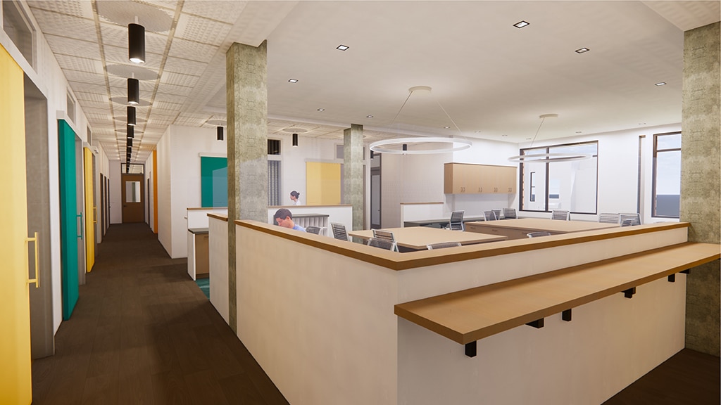
These cues, such as flooring transitions (e.g. from carpeting to LTV) or changes in soffit/ceiling heights, trigger intuitive responses in patients as they move through a space. In the Tepeyac Center, our team drew clear distinctions between open office spaces for providers and the circulation corridors, shifting between carpeting and a lower, intimate dropped ceiling space in the former to LTV flooring and a high, bright ceiling in the latter.
Should a patient find themselves in a back-of-house provider space, the flooring, colors, and ceiling height will all work in tandem to impart an intuitive sense of I’m not supposed to be here. Those same cues will help guide them back to a space in the facility that reinforces the opposite feeling of instinctive belonging.
Reducing stress and improving patients’ moods
The design strategies described above can also be deployed for the purposes of setting the overall mood or ambience of a space. Most people are familiar with the quieting effect that happens upon entering a classic French bistro, with its low lighting and quiet atmosphere.
Low lighting, acoustical modifications, and colors are among the handful of strategies that can be deployed to (positively) affect the psychological experience of patients and their families. Strategies aimed at psychologically calming and quieting people are especially important in behavioral health settings, where the atmosphere should seek to calm and quiet users.
In the Tepeyac Center, we integrated purple and green into the behavioral health department, based on research that has shown these colors to have a calming emotional effect. Likewise, we paid special attention to the flooring of this space, using the transition from “louder” LVT in the main lobby to carpet inside the behavioral health department to cue calmer behavior and lower voices.
Improving patient outcomes and satisfaction with care
Taken altogether, these strategies go a long way towards creating a positive first impression for new patients and visitors. As we are all aware, first impressions are important—and we only get one shot at them! Research has consistently shown that environmental factors, especially in a healthcare setting, can have critical benefits to long-term patient outcomes. Given that the strategies covered above amount to a robust toolkit for reducing patient stress and confusion, our team has made wayfinding a key element of MOA’s healthcare design process.
related thought leadership
Designing for Rural Healthcare Clients
By Kaye Mullaney
Senior Project Manager
By Genevieve Rogers
Architect
Designing a space for a rural healthcare provider can present a very different set of concerns and priorities from designing a similar program for a hospital in an urban setting. Even the...
read moreRevamping Healthcare Facilities for a COVID-19 World
By Katie Vander Putten
Director of Healthcare
By Kaye Mullaney
Senior Project Manager
It goes without saying that the COVID-19 pandemic has disrupted nearly every aspect of our day-to-day lives and operations. This is especially true for healthcare providers, who must find ways to provide...
read more