
Have you ever walked into a doctor’s office and noticed the scuffs on the wall, dated artwork, stained ceiling tiles, or the color that was popular 10 years ago—and thought to yourself, “Should I look for a different doctor?” The way a healthcare space presents itself to patients can be reflective of the treatment being provided.
As healthcare architects, we are often challenged with how to efficiently refresh a healthcare space in a short time frame on a limited budget. We work with our clients to understand their needs and address areas where we can make improvements. In projects with a tight schedule and budget, we typically make adjustments to paint and artwork.
PAINT
Paint is often one of the first things we address when refreshing a healthcare space for several reasons. Paint can make a significant difference in how a space feels to the user. For example, if a space has limited natural light changing the paint color from dark to light can make a huge difference in how the space feels. Lighter paint colors brighten a space more efficiently and cost effectively than coordinating how to transform the space to incorporate more natural light. According to psychologists Patricia Valdez and Albert Mehrabian,
Short wavelength blues and greens generally elicited more pleasure than the longer wavelength reds and yellows. Brighter and more saturated colors were more pleasant, with brightness contributing more to pleasure than saturation. By contrast, saturation contributed more to arousal than did brightness.
Paint can also differentiate the areas of importance in a healthcare space. Rather than allocating budget on additional signage, simple adjustments to paint color can help the patients understand where they are supposed to be. For example, in our Tepeyac Community Health Center project, we gave patient rooms a specific-colored border and left staff areas such as offices, break spaces, and storage closets without borders, dissuading patients from entering those areas. Paint can also highlight landmark areas such as nurse stations, check-in areas, reception, and waiting areas. To achieve this, we might pick a specific color to border the patient rooms and another for nurse stations, and a different color for waiting areas and reception.
We can also incorporate paint colors into hallways and corridors to help guide patients to where they are supposed to go. This is something that might be taken into consideration in larger healthcare facilities where patients are more likely to lose track of where they are going. For example, we might use different colors for different floors, such as the labor and delivery floor and the ICU. In smaller offices, this could be incorporated into areas of the office such as leading the patients to check out once their appointment is concluded to prevent backtracking through the office.
Paint can also be used to communicate and reinforce the brand of a provider or facility. Many healthcare providers have strict branding guidelines and paint is a great way to stick to them.
ARTWORK
Artwork offers another common way to improve the quality of healthcare spaces quickly and efficiently. In fact, a sizable body of research supports claims that artwork improves the healthcare environment. A group of researchers in the UK—Cusack, Fremantle, Isles, and Lankston—examined the implementation of artwork in several hospitals in Scotland and observed:
It has been proposed that the beneficial effects of visual art on health are due to positive distraction. Positive distraction is a term used to describe the belief that environmental
features can elicit positive feelings, hold attention and interest and, therefore, reduce stressful thoughts.
Of course, not all artwork is created equal. Depending on the facility, the artwork we choose can vary widely. For example, we wouldn’t choose the same art for a pediatric office that we would for a primary care office—just as we wouldn’t pick the same art for a behavioral health facility that we would for the primary care office.
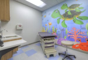
For a pediatric space, we cater to the patients, aware that a doctor’s office could be a scary place for children. We avoid choosing any artwork that a child might find frightening. For that reason, we would likely choose fictional animals or characters as artwork. Why nonfictional? A cartoon snake is a lot less frightening than a photo of a real snake, and we want the space to be as inviting and non-threatening as possible.
In primary care facilities we have more flexibility to incorporate realistic artwork and can even make selections that are reminiscent of the surrounding community. With a primary care office, it is likely that the patients live locally, so incorporating artwork that represents the community is an inviting and welcoming way to select artwork.
While it is appropriate to incorporate realistic and intentional artwork into a primary care office, it is not for a behavioral health facility. In a facility like this, we want to avoid including specific components that may illicit memories of trauma to a patient. With landscape and cityscape, we need to be careful to not be specific, as specific locations may be associated with patient traumas. Rather than incorporating specific art we try to incorporate abstract art, such as the work of artist Henry Domke. His work features close-ups of nature such as a ripple of water, or a close-up of a flower, creating a vagueness that is difficult to associate with specific memories.
When we want to upgrade a space in a cost-efficient and timely manner without disturbing building infrastructure or systems, paint and artwork are great tools to successfully transform a space.
related thought leadership
Designing for Rural Healthcare Clients
By Kaye Mullaney
Senior Project Manager
By Genevieve Rogers
Architect
Designing a space for a rural healthcare provider can present a very different set of concerns and priorities from designing a similar program for a hospital in an urban setting. Even the...
read more Designing Sensitive Hospice Environments Through User Experience Mapping
By Katie Vander Putten
Director of Healthcare
Empathy is part of my job as a healthcare architect. Every architect, of course, strives to design spaces that are sensitive to the needs and desires of users. However, healthcare design requires...
read more